Thursday, 31 May 2012

Digital Collage Continue

 "Music Enthusiast"
Stock Images by 3R Stock on Deviantart.com
Please check out and support this account.
[http://neokeitaro.deviantart.com/]
[http://neokeitaro.deviantart.com/gallery/4452059#/d168kwk]
 ((Female figure and curtains found on Google images))


 "Science Experiment"
 Stock Images by 3R Stock on Deviantart.com
Please check out and support this account.
[http://neokeitaro.deviantart.com/]
[http://neokeitaro.deviantart.com/gallery/4452059#/d168nme]
((Female and curtains found in Google images))


Digital Collage

"The Tinkerings of a Gentleman's Mind"


Photoshop CS5
(All manipulated images found on Google image.)

Wednesday, 30 May 2012

Spook! Monkey #10

Monkey Drawing Challenge complete! 10 Monkeys for 10 Days! 
It was an interesting challenge that I set for myself, probably wont be doing it again for a while though.

Tuesday, 29 May 2012

Le Artist, Monkey Day 9


Blossom Tree


 After watching the video of how to paint a Cherry Blossom tree (shared in the video post below) I was inspired to try it out for myself. It is beautifully unpredictable how the ink flows along the page and it was lots of fun painting this. I wanted to have a coloured background so I first painted a gradient blue and green 'sky' using water colour paint, then used the ink and straw technique to create the branches and then acrylic paint for the blossoms. I used more red in my blossoms because I wanted them to look a little more like Chinese Plum Blossoms rather than Japanese Cherry Blossoms. I'm really happy with how this turned out.


Monday, 28 May 2012

Toast is evil; Monkey #8


Painting with Ink

I was exploring the contents of youtube for new and interesting painting techniques and found this intriguing video of how to paint a Cherry Blossom tree, using ink and a straw to create the branches and stippling paint to make the petals. It looks fun and unpredictable so you know each set of tree branches will be unique.
 

Sunday, 27 May 2012

7th Monkey, Sleepy

Monkey drawing day 7, challenge almost over.


Once I have all my school work out of the way I promise I'll upload more than monkey illustrations.

Saturday, 26 May 2012

Bad Monkey; Day 6

Black BiC pen

Comic Pannel

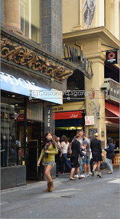
Ever since I was a young kid I've read comics, and one day I hope to be a successful graphic novel artist. But before I learned about perspective and how to draw backgrounds for my comic ideas, I used to use photoshop to alter photos to make the backgrounds. I thought I might upload this technique to show anyone who may be interested. Basic photoshop skills required (just as long as you know the tools)

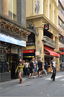
First start with a photo of your choice, I used a photo I took while on an drawing excursion to the city.

Then use the cropping tool to crop the image to whatever scale you like.


Next click Filter>Pixelate>Colour Halftone (make sure you have black and white colours selected)
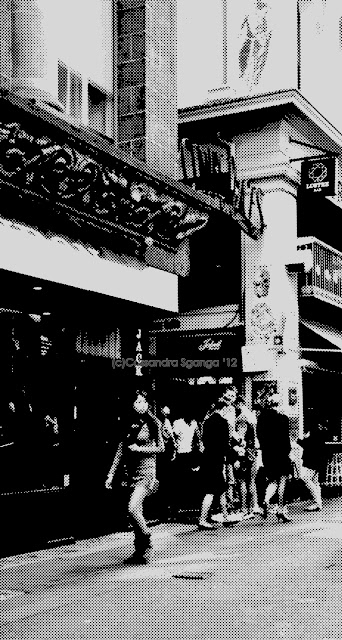
You'll get this spotty old comic book effect.


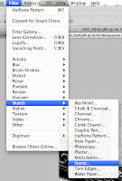
Next, select Filter>Sketch>Stamp


By this point it's personal preference to change the detail/contrast of the image, but I changed my settings to;
Light/Dark Balance: 32
Smoothness: 1 


And here you go! Hope that was either of some use or entertaining.


Friday, 25 May 2012

Ballad Monkey; No.5

Inspired by the Eurovision Song Contest 2012

Black BiC pen.

Thursday, 24 May 2012

Light Photography

 On a sunnier day than this drizzly one we're having currently, I practiced some photography and using the zoom lens to capture the light bouncing off my cat (Angel)'s fur as he slept on the old picnic table.


Falling Petal

I've realised that one thing I haven't mentioned on my blog is that as well as art and crafts I'm very passionate about animation. When I was a kid all I did was watch animations and when I saw my first episode of the Japanese anime PoKeMoN I knew I had to learn how to animate. I've made a few small animations in the past, usually running on a loop, all of which were made using Flash. Usually I'd make individual 'symbols' then piece them together and animate them using 'motion tween', but this time I made this quick animation test of a falling cherry blossom petal by drawing each little movement individually for each second of the test film. This is based on a larger idea I had for a short animated film. I've also been commissioned to create a full length animated film, but because of tafe that project has been put aside for a later date.


Hot Chilly! Monkey #4

This Monkey was requested by my sister. 


He didn't turn out as cute as I'd have liked but it's something for me to work on.

Wednesday, 23 May 2012

Ringmaster; Monkey Day 3

Roll Up! Roll Up! 
The circus is in town!
I drew this Ringmaster Monkey while listening to circus themed music. 

I personally love the circus, but more so, 'evil' circuses, dodgy vintage 'freak shows' and creepy clowns. I know some people have a fear of them but I think they're great. I laugh my head off at movies like "IT" and "Killer Klowns from Outer Space" and I enjoy drawing creepy things. For a large painting piece I'd like to do a circus themed creation, possibly centered around an eerie Ringmaster or evil clowns.  

Tuesday, 22 May 2012

Monday, 21 May 2012

Barrel of Monkeys

Well, a sketchbook more like. Inspired by the book by Stefan G. Bucher "100 Days of Monsters" where he drew a monster each day for 100 days, I'm going to set myself a little art challenge of '10 Monkeys for 10 days'. I used to draw monkeys a lot a few years ago, so now I think it's time to draw a few more. Starting with...

Monday Monkey
 (He's not too fond of them either)
  Drawn entirely with ink pen

Sunday, 20 May 2012

Art Journal Tutorial

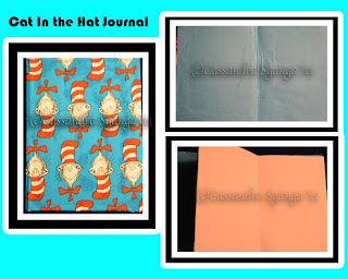
I love books. Art books, story books, fact books and all forms of books. Last year I found a great two part tutorial by TRANSiENTART on youtube. I made 3 art journals using it. My best one that I made for a friend I sadly don't have any photos of. It was a hand sewn patchwork leather bound book with a metallic Celtic symbol painted on the front. The photos I do have here are of one of the very first ones I made, and admittedly not my best. But I wanted to include it because it's not perfect. The glue is visible, there are wrinkles in the inner cover and truth be told there was a lot of trimming to get the pages even. BUT I'm still happy with it because it was a new experience with crafting something I love (and it's The Cat in the Hat (c)Dr. Seuss) and I wanted to share this learning experience with you!

My (im)Perfect art journal:


The Tutorial I learned how to make my own books from (Part 1 & 2):


Saturday, 19 May 2012

Nature Walk Photography


Again more photos from the Abbotsford Convent excursion. I really like taking photos of nature. I should mention this was my first time using a DSL camera, so I still hadn't quiet got the hang of things like zoom and focus, but I like how these turned out not completely in focus, because that's how I feel when around nature, everything is kinda hazy like in a dream. 

Thursday, 17 May 2012

Abbotsford Convent; 'Graffiti Art'


On the walk back from the Abbotsford Convent excursion I took some photos of the graffiti painted along the bike path. The topic of 'street art' or Graffiti, and whether or not it's actually art is a bit sketchy. Some people like it, some think it's vandalism and others are indifferent. I'll admit I've seen better graffiti than these, but I still like them and think they do have artistic merit to them. The artists have put thought into them and composed the lettering and illustrations to create an art piece with text, kind of like typography. Plus they're not harming anyone. I don't like taggers who just draw their dodgy signature in a sharpie on someones fence, but things like this, and the street art along Brunswick St I can enjoy looking at and admire the skill. I know I'd never be able to paint something like these using spray paint.
(I don't think I'd every try this though, even on a canvas. I wouldn't understand what the heck I'm writing)      

Wednesday, 16 May 2012

Collage and Altered Art

So as it turns out, we didn't end up painting in class today so my previous post about painting Hyuna will have to wait. Instead we practiced collage techniques using different ways of transferring drawings and photo images onto paper. Similar to techniques I've seen used in 'Altered Art'.
Altered art is basically a form of 'glamorous collage' that doesn't just apply to paper or canvas, but anything you want, for example 'altered books' and 'altered jewelery' are very popular and quite stunning aesthetically. Altered art usually focuses on making whatever you're creating look vintage and elegant as well as intricate. Two things I've seen reoccurring in this form of collage are old black and white and sepia photos (usually of women) and ink stamps.

Whenever I go to craft shows I always see women selling ink stamps for collage work, and look at their examples of old forgotten books (normally hard cover) that have been turned into delicate masterpieces. I've tried my own take on an altered art book, and still working on it. It's fun to see what you can create from almost nothing and it's great for just experimenting and having fun with different mediums. To really see what I mean I found a video on youtube showing how one woman made a very beautiful mini photo frame from slide mounts. You can find a lot more on youtube but not all of the 'crafters' displaying what they've made have filmed in good quality, and some just talk for 20 minutes without even showing what they made. So here's just one example. Hopefully i'll have some photos of my own altered art to upload soon.


Tuesday, 15 May 2012

Hyuna, Pre painting sketch.

A 10 minute pre-painting sketch of Korean singer Hyuna which I'm planning on using for a school painting project in the morning. If I don't end up using it I'll just develop it further into a proper portrait.  

Monday, 14 May 2012

Abbotsford Convent (Photography Excursion 2012)


Some of the building photos I took on an excursion earlier on in the year to the Abbotsford Convent. (Some slight photoshop tweaking). More to come in future posts.

Sunday, 13 May 2012

Fallen Roses


Some sentimental photography. I explained more about it here:  http://souljester.deviantart.com/art/Fallen-Roses-294818919

Saturday, 12 May 2012

Recycling Nostalgia

While out shopping yesterday I came across a new product by cosmetic brand 'My Beauty Spot'; a small set of pocket 'matchbox nail files'. Immediately I was reminded of 'REDHEADS' matches. As a kid with the numerous birthdays and birthday cakes, we would always light the candles with 'Redheads' matches. Never used any other brand. Looking at the packet of nail files in the store I started comparing the designs and how whoever created the front of the nail file packet captured and recreated the Redheads packet into a new design, knowing that many people would recognise the interpretation and be more inclined to purchase it due to the 'nostalgia' of its design, much like how I was. 

Images are always being reused and recycled, whether it's in art, fashion, advertisement and so forth. I love the way the nail files have been made to look like matches, not only by mimicking the look of Redheads, but the packet has been designed like the little individual matchbox packets gentlemen used to carry in their pockets to light cigarettes with before lighters. The character on the front has been made to appeal to a younger female audience, perhaps between 13 and 25, the pink instantly draws the attention of younger teens, but the character herself is a glamed up Rockabilly inspired design with a 1950's 'victory roll' hair style and bombshell makeup, which is what gets the attention of older teens and women in their early twenties. Plus adding the black to the design helps take it a step down from 'girly' and a step up to 'chic'. I'm not a graphic designer or a typographer but I think the style and design has pulled together well.

It's a big change from the classic Redheads deign off flat mat colouring with a clean and simple design. Well, both products have a pretty simple design, however while the 'Nail Head' nail files have a more modern look to them, the Redheads are more retro and saucy like the female heroins of 70's comics and cartoons.       

Another thing I noticed that the two products have in common is their use of double meanings. Seeing as they are both products of advertisement they have to grab the audiences attention, and what better way to grab a persons attention than by using sexual innuendo! Aside from the fact both products include the word 'head' (when neither product has any use for the cranium), the Redheads matches are described on the front as "Longer, Thicker..."and are shown on the front of the box as pretty upstanding. Funny, looks like in the world of matches size is an issue for competition. The 'Nail Head' nail files have a more direct slogan; "Get Nailed...!!!". A strange encouragement from a nail product, but I got a giggle out of it.

It's true when they say 'Sex Sells!', and this has gotten me thinking of new projects to work on and develop revolving around the topic of sex in advertisement, old and new.                 

Friday, 11 May 2012

Fashion Shoot 2010 'Cosmic Nebular'

Here are some photos I took back in 2010; A Sci-Fi themed costume designed and made by me as part of my yr 12 fashion folio 'Cosmic Nebular' (c) . Modeled by my dear friend Laura Pearse. This was my first attempt at a proper photo shoot (with a dodgy 5 year old camera that didn't really work anymore, but it more or less did the trick). The photos, as well as meaning to have a 'fashion photography' look about them, are meant to help tell a narrative about an Alien Warrior who lands on Earth in her travels and starts scouting out the deserted industrial location she finds herself in.